Challenge
In collaboration with Ayesha Din and Valeria Olmos, we were tasked to brand a conceptual conference and visually bring it to life. This conference would be a space for young creative entrepreneurs to expand their ideas, pursue a professional goal, and/or create a brand for themselves to further their careers. The challenge was to create a brand that communicated these values and catered to young creatives.
Solution
While brainstorming names, our goal was to communicate what the conference embodies— creativity and new beginnings. We researched symbols of these concepts and became particularly interested in moon phases and how the moon shines and illuminates the sky. The word "sheen" eventually stuck out to us. We were drawn to the term's elegance and its meaning: a soft glow.
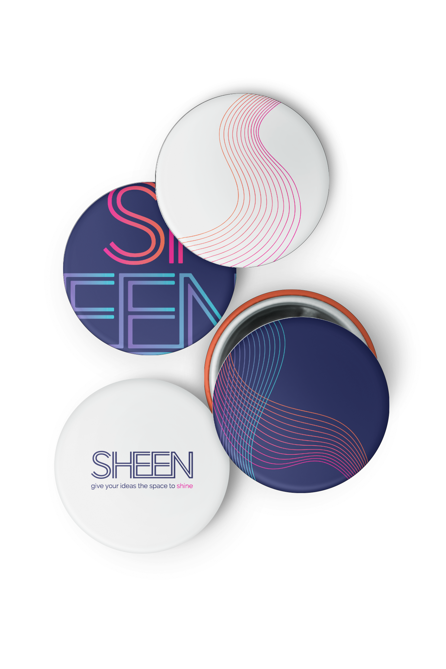
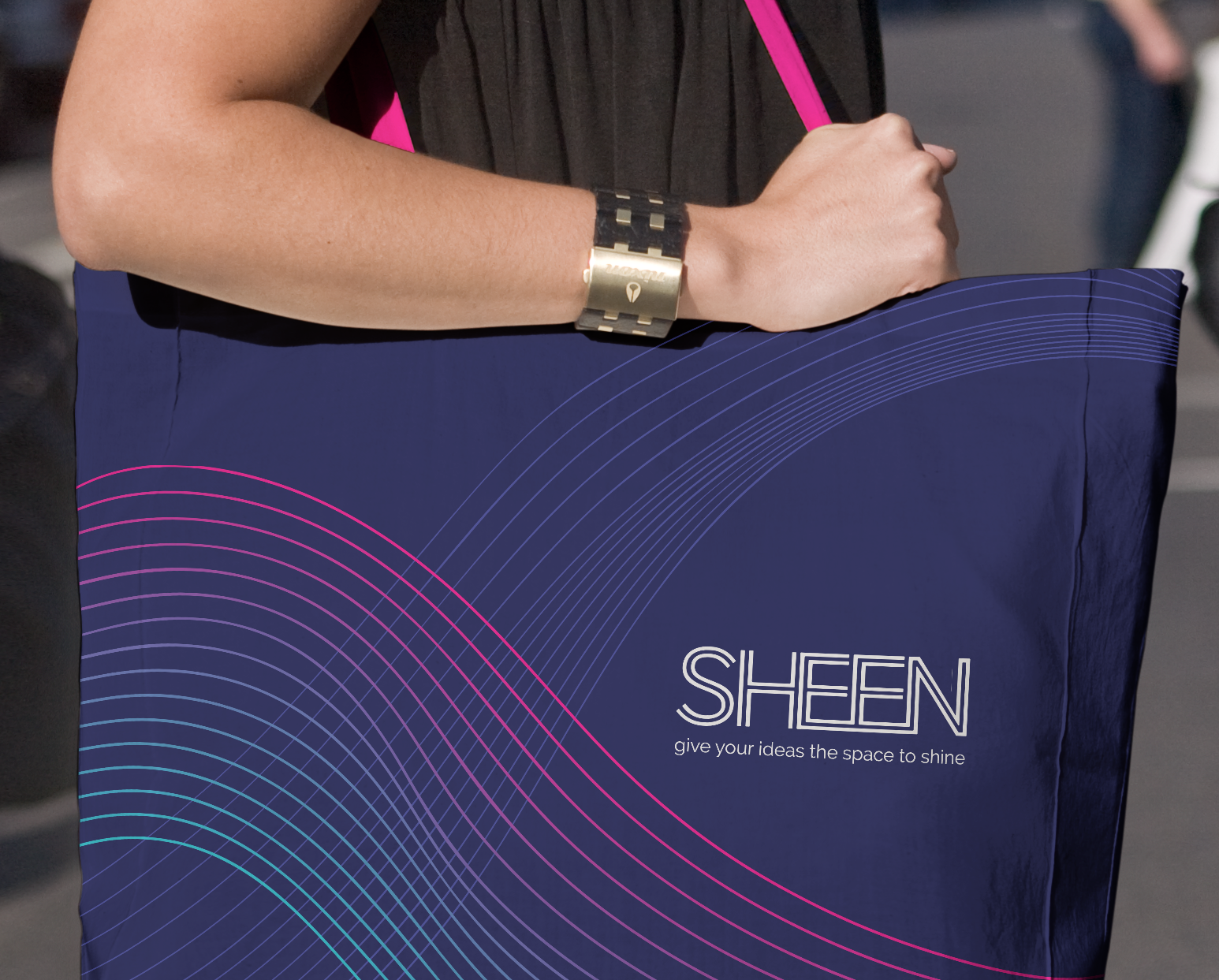
When designing the logo, we aimed at keeping it clean and sophisticated. We picked a font that alluded to pathways to further communicate the conference's agenda of providing opportunities and professional help for creatives who are seeking it.
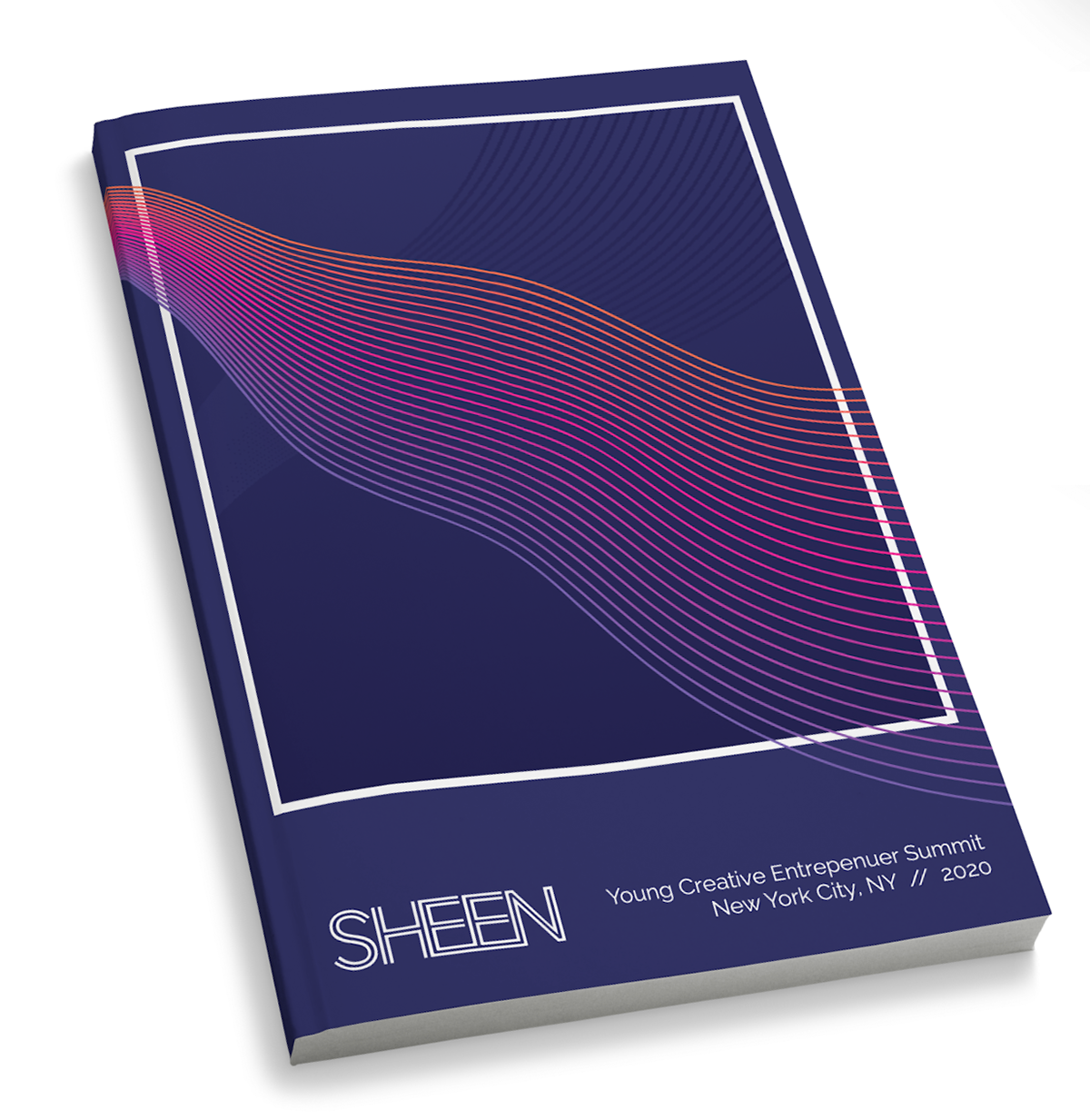
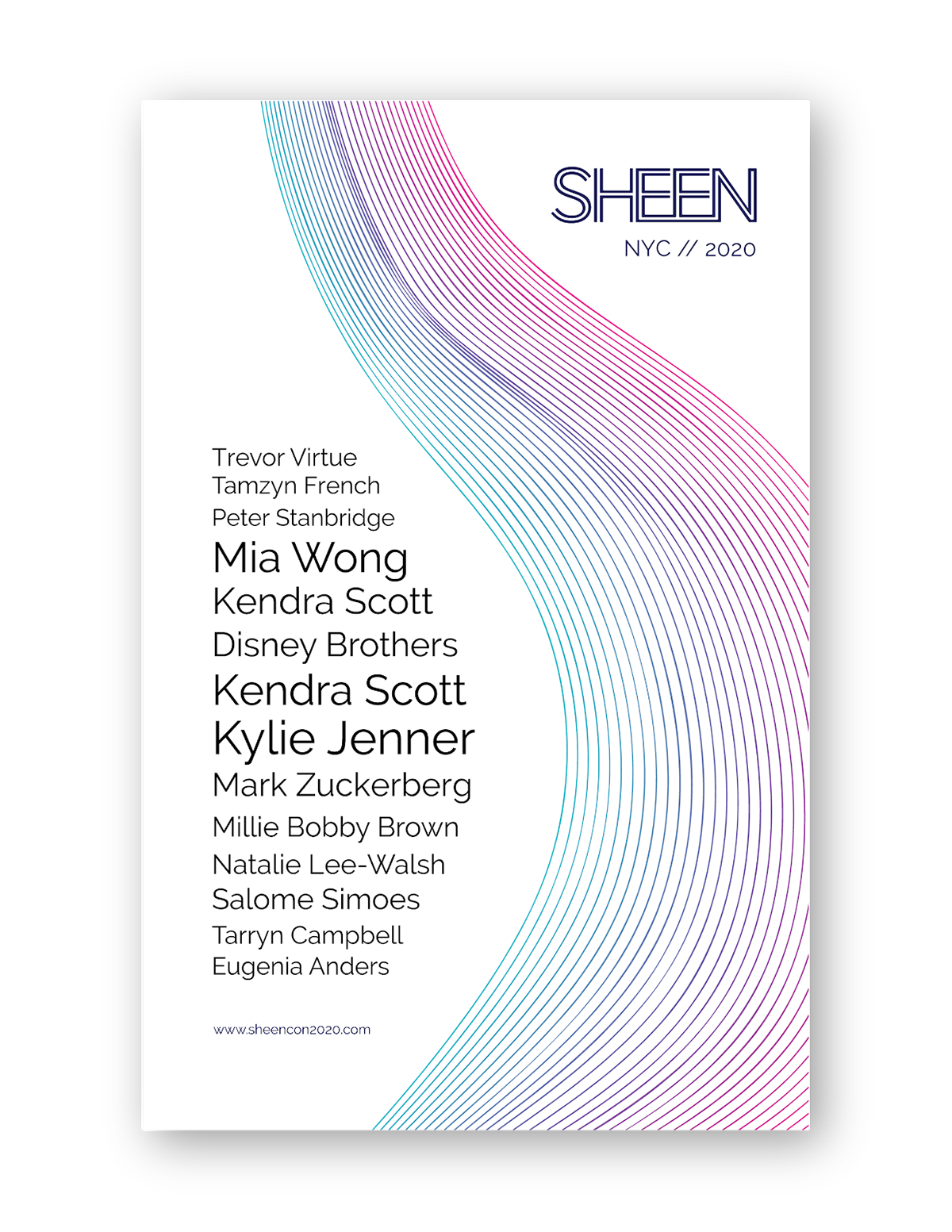
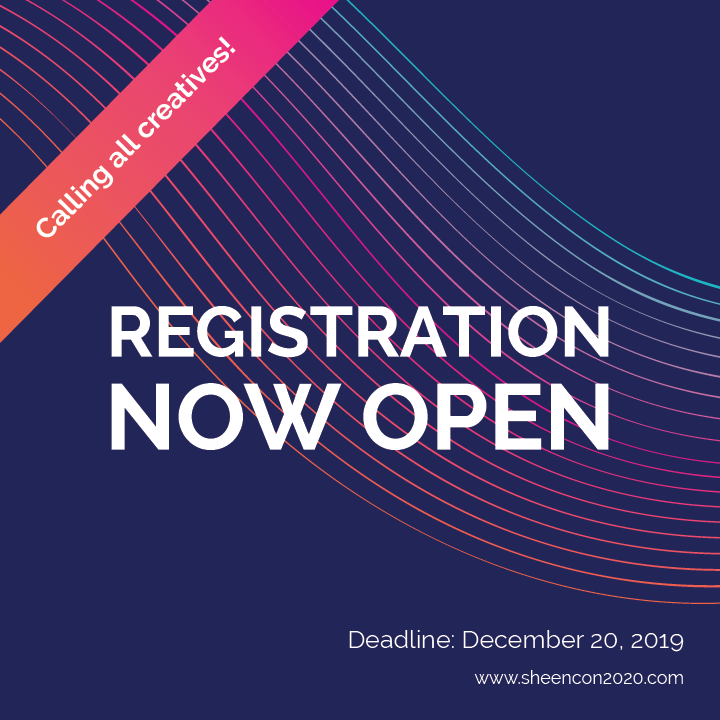
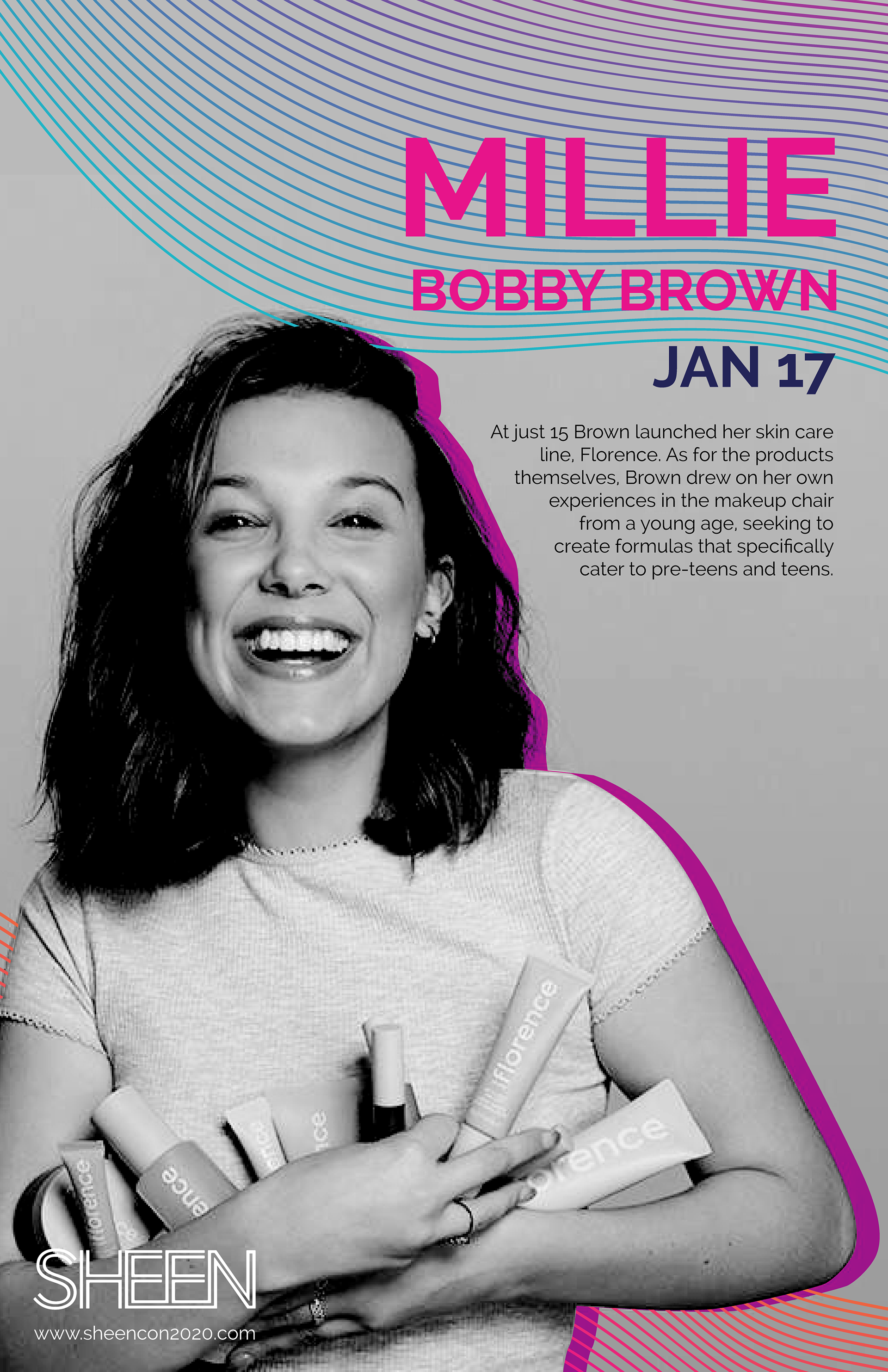
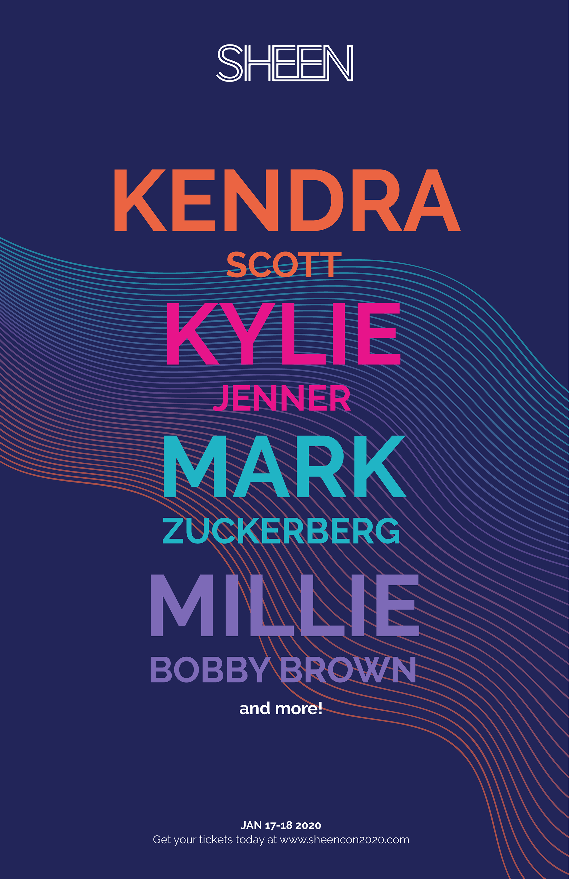
Dark blue-purple was chosen as the main color and bright pink, blue, purple, and orange as secondary colors. Bright colors against a dark background paralleled the vastness of the night sky. For graphic elements, we created gradient waves to further indicate pathways and opportunities.
Logo
Social Posts





Advertising/Promotion

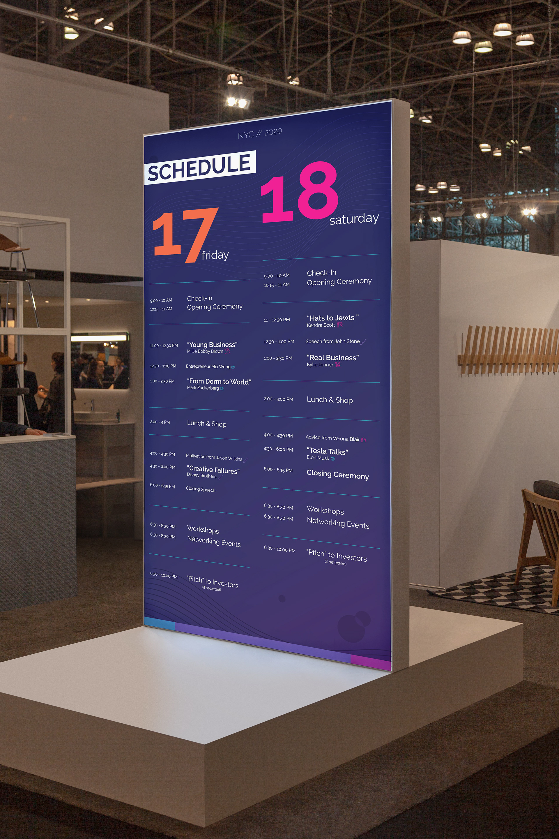
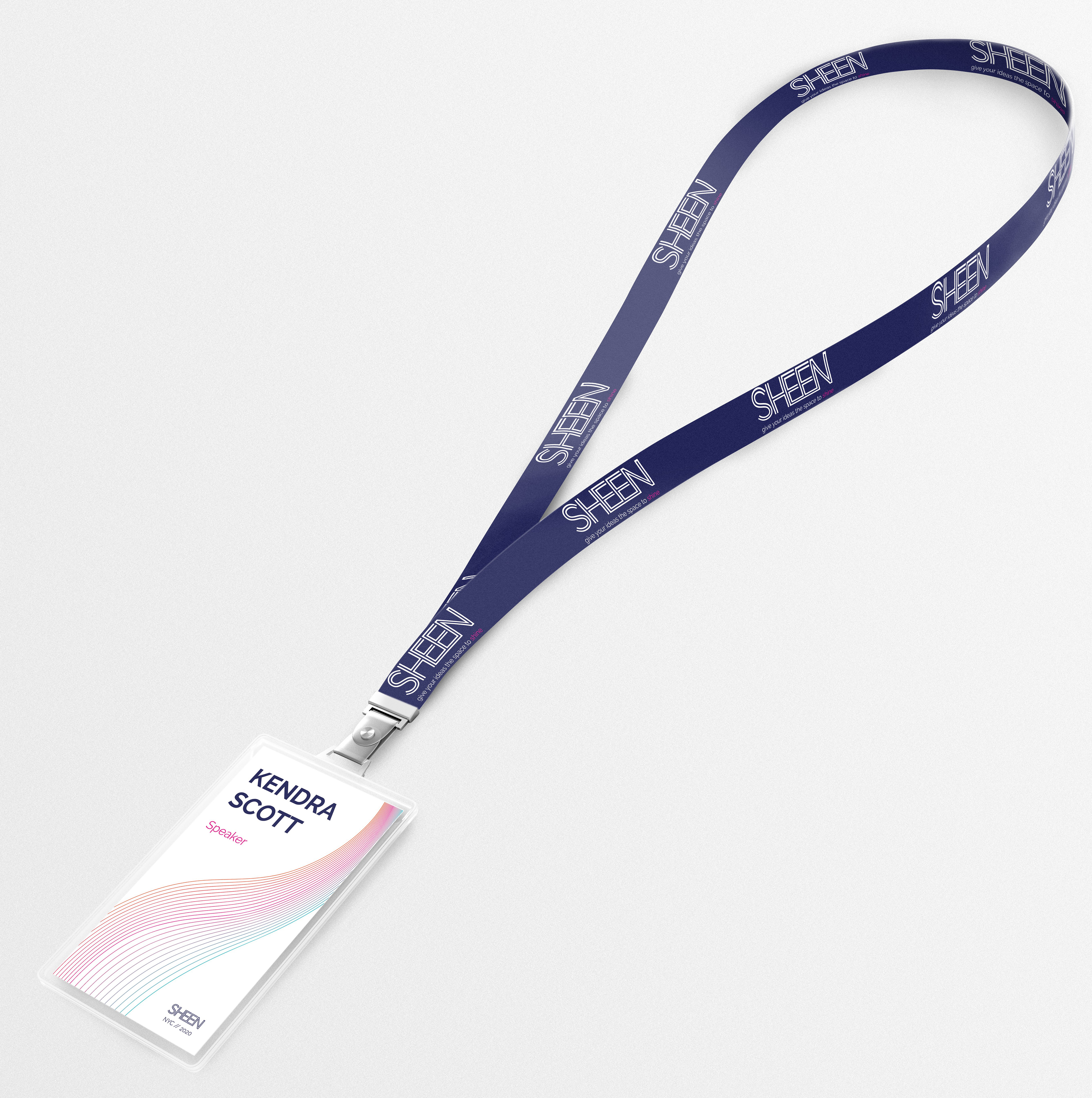
Conference Materials & Merchandise
