Challenge
The current visual identity of Crisis Text Line can be intimidating and stressful due to the predominantly red color palette. Additionally, the language can seem static and impersonal. In collaboration with Marley Crawford and Michelle Tamir, we were tasked to rebrand Crisis Text Line. The challenge was to visually tell a new story that is more friendly, understanding, and cohesive.
Solution
We renamed the organization to "Feels" to establish a new norm of exploring feelings. We wanted to encourage our new target audience—teens and preteens—to share their thoughts so that the text line can understand and work through their complex and overwhelming experiences. When creating the logo, we utilized soft and playful typography to indicate approachability and openness.
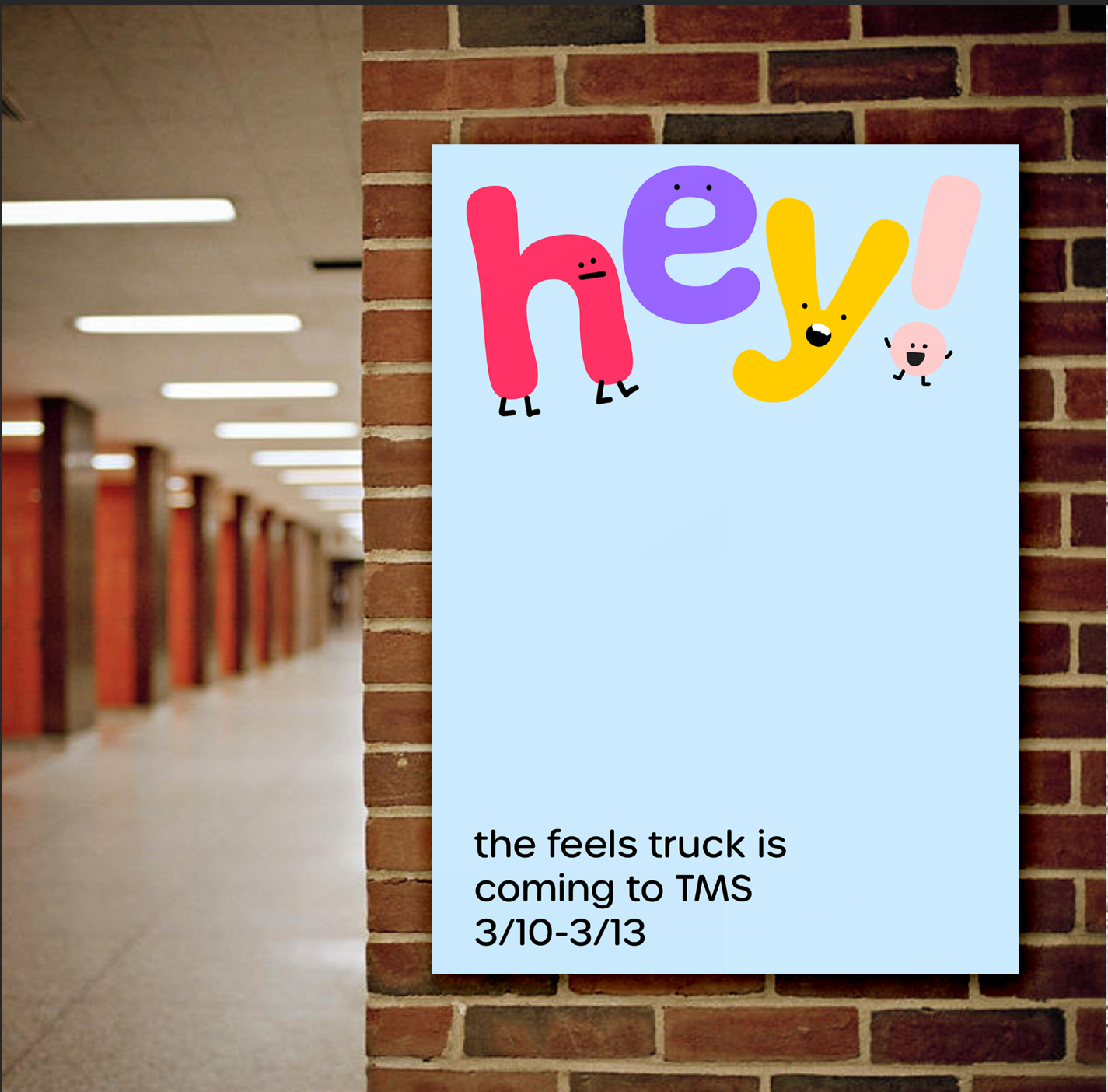
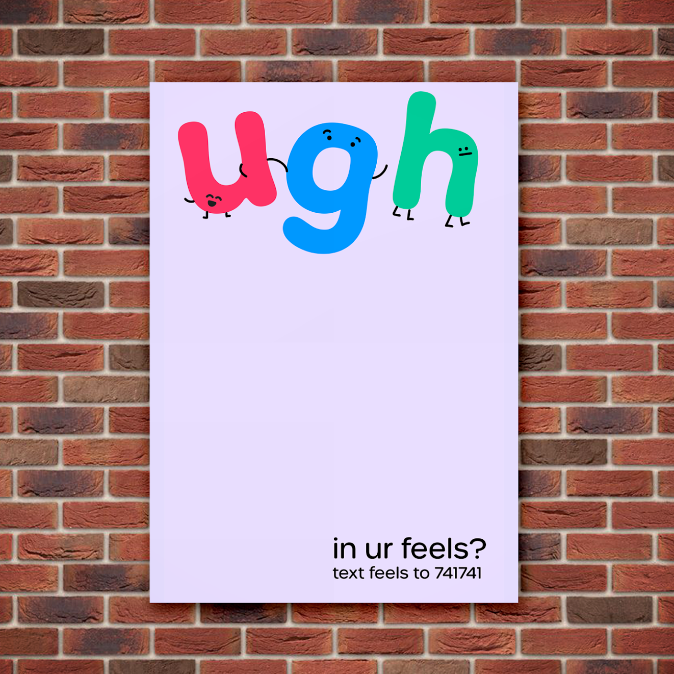
A broad color palette was utilized to display the diversity of crises the youth encounters. Similarly, illustrated characters with different facial expressions were incorporated to show the range of emotions this group can go through. Relatable characters and additional colors created an atmosphere of friendliness, calm, and support.
Graphics
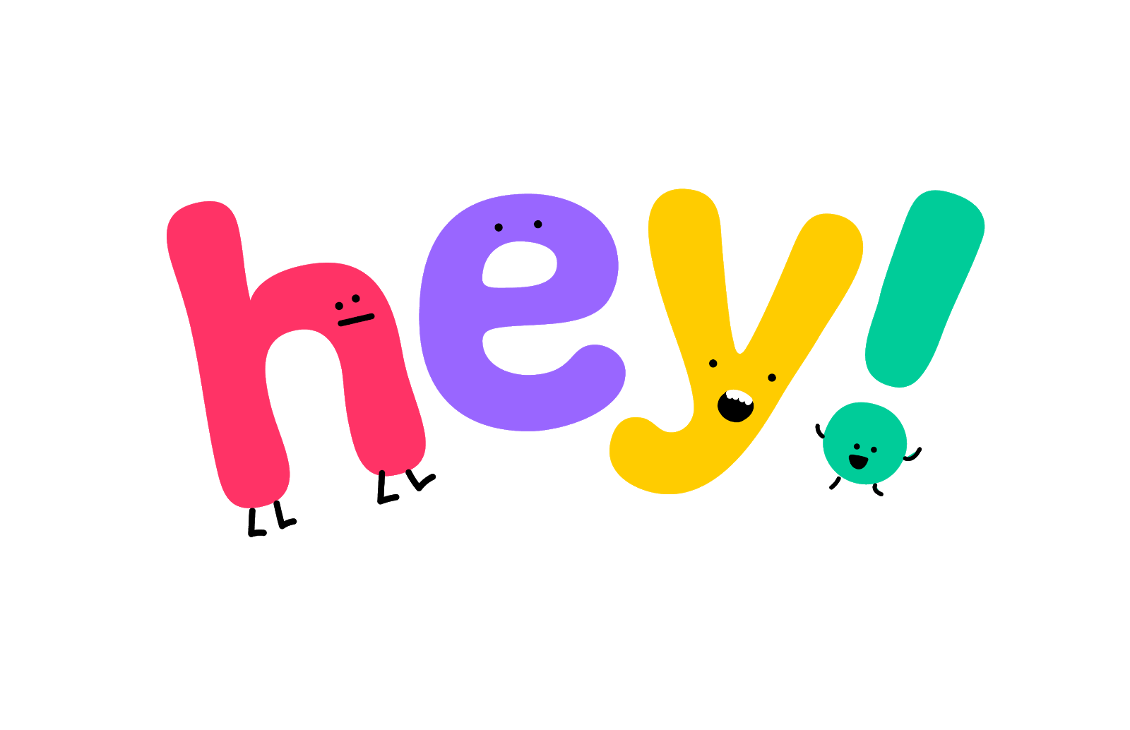
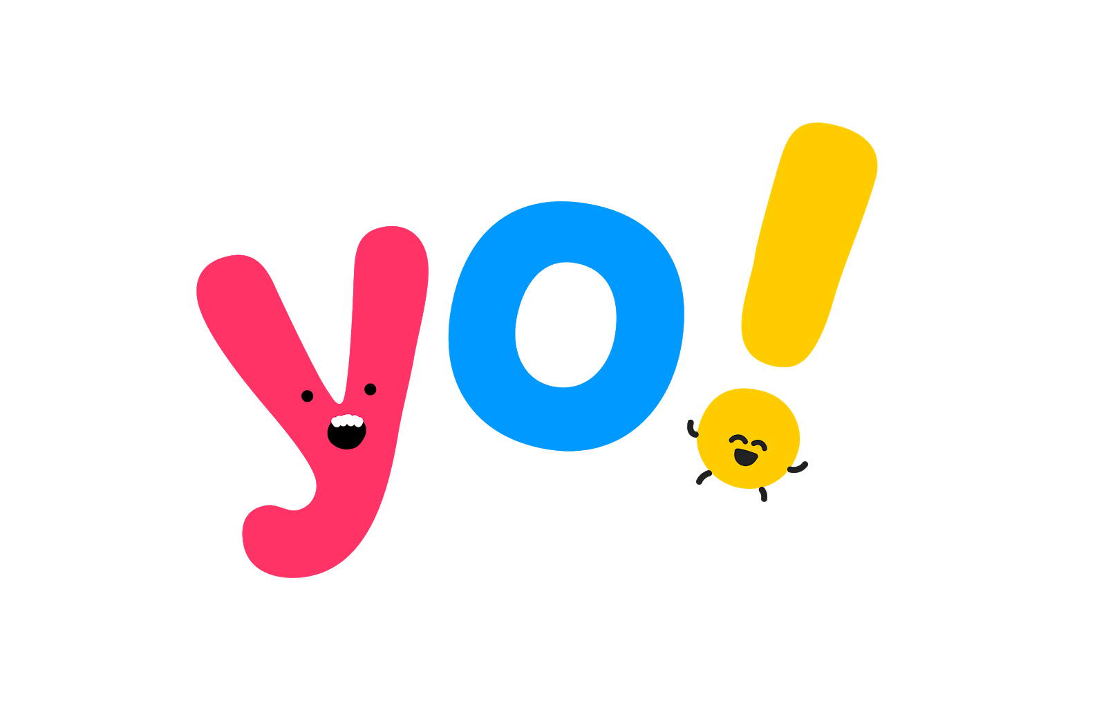
Website Layout
Advertising/Promotion
The Feels Awareness Campaign is centered around middle and high schools. Teens and preteens tend to experience anxiety and stress during school. Therefore, visits to schools could reassure students that they are not alone in their struggles. The Feels truck is a fun experience in that students can visit, chat with volunteers, and do fun and therapeutic activities such as drawing.
